First Impressions Count: How to Attract New Listeners with Your Home Page (5 Tips)

Your podcast website is as important as your podcast and episodes, so perfect it and make sure it’s beautiful and loading rapidly is a great idea. Are many of your visitors leaving almost as soon as they reach your site? If so, your home page may not be making the right first impression. Users typically form an opinion about a web page within 50 milliseconds. That’s two to three times faster than the average human blink.
Fortunately, there are strategies you can use in your home page design that encourage visitors to stick around and take action. As we’ll see, a pinch of psychology and a dash of methodical testing can go a long way.
In this post, we’ll discuss what a great first impression can do for your podcasting business. Then we’ll walk through five ways to improve your home page and attract more listeners. Let’s get started!
Why First Impressions Are Important
How much does your site’s visual design impact how visitors perceive it? The answer is quite a bit.
Right from the initial content loaded onto the page, the visitors can get a first impression of your website and your podcast. It essentially gives them a quick background for your own storyline.
With over two million podcasts out there, this space is becoming very crowded. If your site doesn’t lure listeners in right away, you may lose them to the competition.
How to Attract New Listeners With Your Home Page (5 Tips)
Your home page isn’t about you as much as it is about your visitors. Consider your own experiences browsing the web. When you access a new website, do you read through every word?
The answer is probably not. Most likely, you’re looking for what the site can do for you. If you can’t figure that out quickly, you’ll leave.
However, if the benefit to you is clear, you’re more likely to stay, explore, and become a listener. Here are five ways to make that happen for your podcast site’s visitors.
1. Make Your Hero Banner Heroic
A hero banner is a large image at or near the top of the page, often with some overlay text:
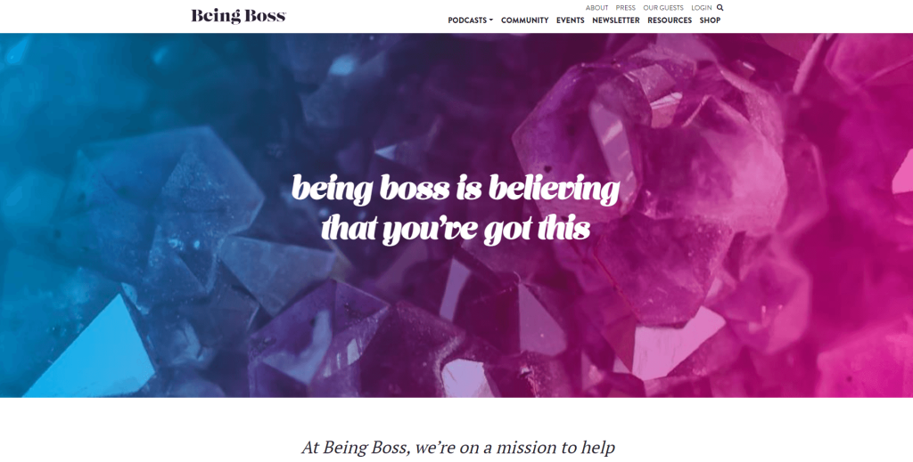
The hero banner is a great place to set a tone and showcase your brand story. You can also use it to engage visitors by including a clear Call To Action (CTA).
Whatever image you choose, make sure it’s visually appealing and evokes thoughts or emotions by association. For example, your face may be one of your best marketing tools.
We make immediate emotional connections with human faces. Therefore, consider taking a high-quality hero banner photo that shows your face (and that of your co-stars if relevant) prominently.
2. Showcase Both Audio and Visual Content
As the home of a podcast, your website has an advantage that many other sites don’t: it combines both visual and audio content. This is a powerful combination that impacts two senses at once.
For an example, check out the strong visual elements of the Twenty Thousand Hertz podcast:

These visuals make it crystal-clear what the tone of the podcast will be, and make the visitor want to learn more.
You don’t need visuals this elaborate. However, it’s best not to take the easy way out and use your platform’s default styling. Instead, deliberately choose colors and images that reinforce your podcast’s theme and tone.
If you need to source free images and videos, you can start by browsing royalty-free image sites such as Pixabay and Pexels.
3. Feature a Strong Call to Action Above the Fold
You may think that unlimited options make people happy, but it can create indecision. When a website doesn’t offer a clear course of action for its users, they may get confused and leave.
Fortunately, you can use a Call to Action (CTA) to signal to visitors what specific step they should take next. The most effective home page CTAs are usually simple. You might use phrases like “Listen now”, “Subscribe to our podcast“, and “Get in touch”.
A site’s main CTA is often placed in a button ‘above the fold’. That’s the part of the website visitors can see without scrolling:
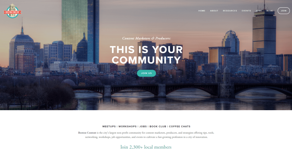
This CTA is clear and concise. In addition, it makes the benefits of taking action very clear.
You can CTAs to engage your visitors from their first interaction with your podcast site. Keep them brief and simple, but make sure it’s obvious to users what will happen when they click on the link or button.
4. Design with Usability in Mind
Usability refers to the ease with which a user can interact with an interface. Is your website easy for a first-time visitor to figure out? Are interactions quick and frictionless? Are the pages pleasant to interact with?
These are all factors that go into a usable interface. If your site isn’t usable, your visitors are less likely to stay and become fans.
Fortunately, you don’t need to be an expert to create a usable website. A basic understanding can go a long way.
First and foremost, make sure your layout is universally familiar. For example, don’t put the main navigation at the bottom of the page, or anywhere else that forces users to search for it. It’s best not to try and reinvent the wheel. Simple buttons and links have worked for decades, so you don’t need to come up with fancy new interaction schemes.
Most importantly, keep your layout simple and uncluttered. It should always be easy for your visitors to figure out where to click to get what they want.
5. A/B Test Your Site
Finally, don’t forget to test your website’s design. A/B testing, or split testing, is a method for discovering what works on your site and what doesn’t. You create two (or more) versions of a page, and randomly serve one or the other to each visitor.
From there, you can determine what’s working based on your goals. Which version of your site gets more conversions? Which one do users engage with the most? The least?
To conduct A/B testing, you can use one of many user-friendly tools. Some are free but offer only basic functionality. In many cases, that’s all you’ll need for a straightforward podcasting site.
Conclusion
Building website content that engages visitors doesn’t have to be daunting. By making a few tweaks to your home page, you can draw people in and keep them around long term.
To recap, here are the best strategies for grabbing attention with your podcast website’s home page:
- Create an effective hero banner.
- Use both audio and visual content.
- Have a strong above-the-fold CTA.
- Make your home page usable.
- Perform A/B testing.
You can browse our blog for more information on how to start and run your podcast website!